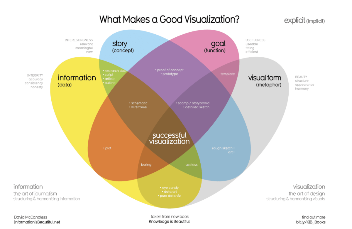
The best practices in data vizualization
Data visualization is a powerful tool that can help make complex data more accessible and understandable. By presenting data in a visual format, it can be easier to identify patterns, trends, and insights that might otherwise be difficult to detect. Here are some best practices to keep in mind when creating data visualizations:
Keep it simple: One of the most important best practices in data visualization is to keep it simple. Avoid using too many colors, shapes, or other visual elements, as this can make the visualization cluttered and difficult to understand. Instead, focus on using a few key elements to convey the most important information.
Use the right chart type: Another important best practice is to use the right chart type for the data you are trying to present. Different types of data are best suited to different types of charts. For example, line charts are typically used to show trends over time, while bar charts are best for comparing different categories of data.
Use labels and annotations: Labels and annotations are an important part of any data visualization. They help to explain the data and provide context for the reader. Be sure to include appropriate labels and annotations on your charts and graphs, so that the reader knows what they are looking at.
Make it interactive: Interactive visualizations can be very effective in engaging the viewer, allowing them to explore the data and discover insights on their own. Interactive elements such as filters, zoom and pan can also help to reveal patterns and trends that might otherwise be hidden.
Tell a story: Data visualization is not only about presenting data, but also about telling a story. A good data visualization should be able to communicate a clear message and convey a story. By focusing on the key insights and findings, you can create visualizations that are both informative and persuasive.
Test and revise: Before finalizing a visualization, it is important to test it with different audiences, to get feedback and make sure it is effective in communicating the message. If necessary, revise the visualization to make it clearer, more effective, or more engaging.
In summary, data visualization is a powerful tool for making complex data more accessible and understandable. By following best practices like keeping it simple, using the right chart type, using labels and annotations, making it interactive, telling a story, and testing and revising, you can create effective and engaging data visualizations that help to reveal insights and communicate key findings.

28 Comments